Branding Major Project — Brand Identity System
Sameway 同路
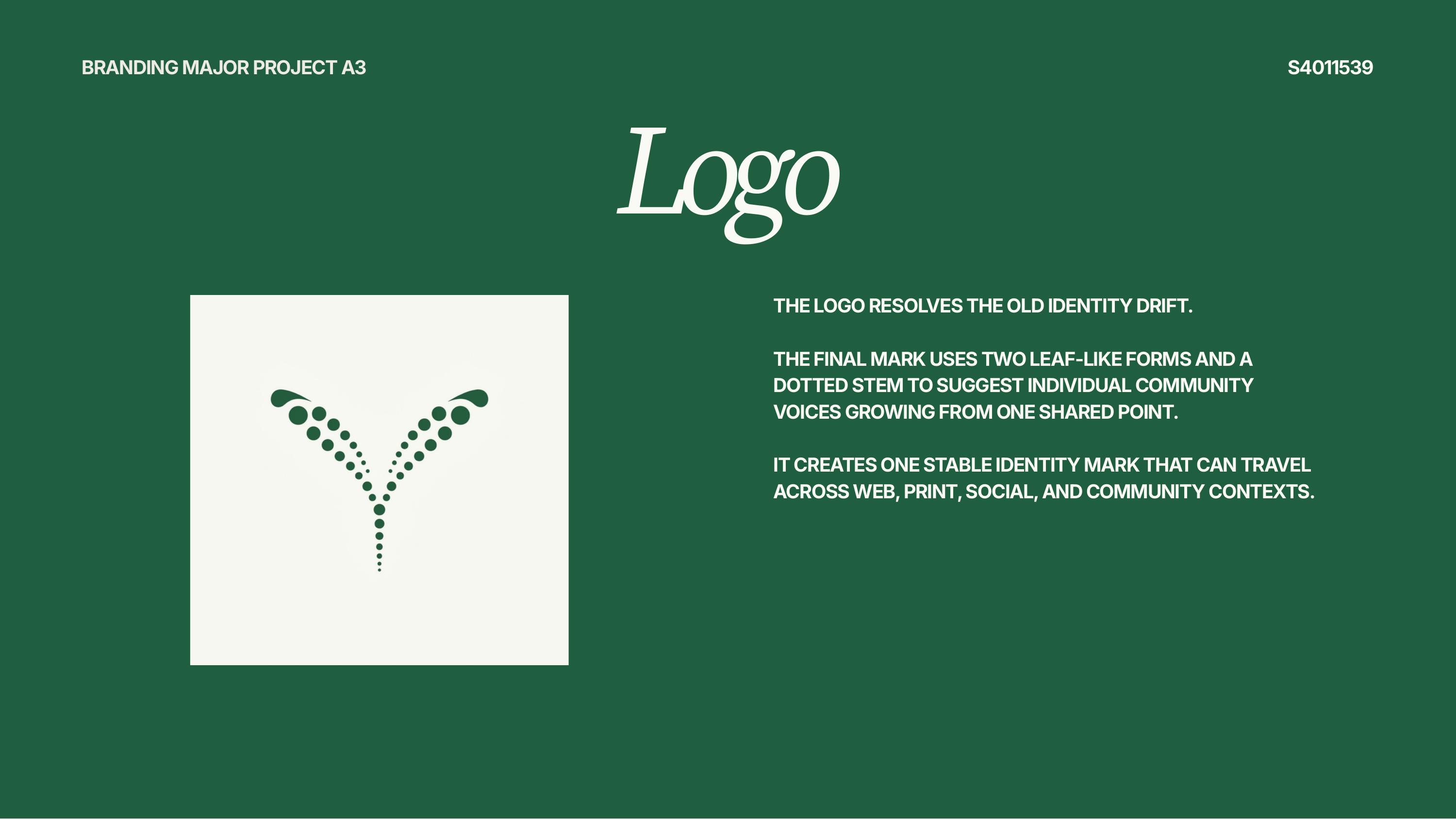
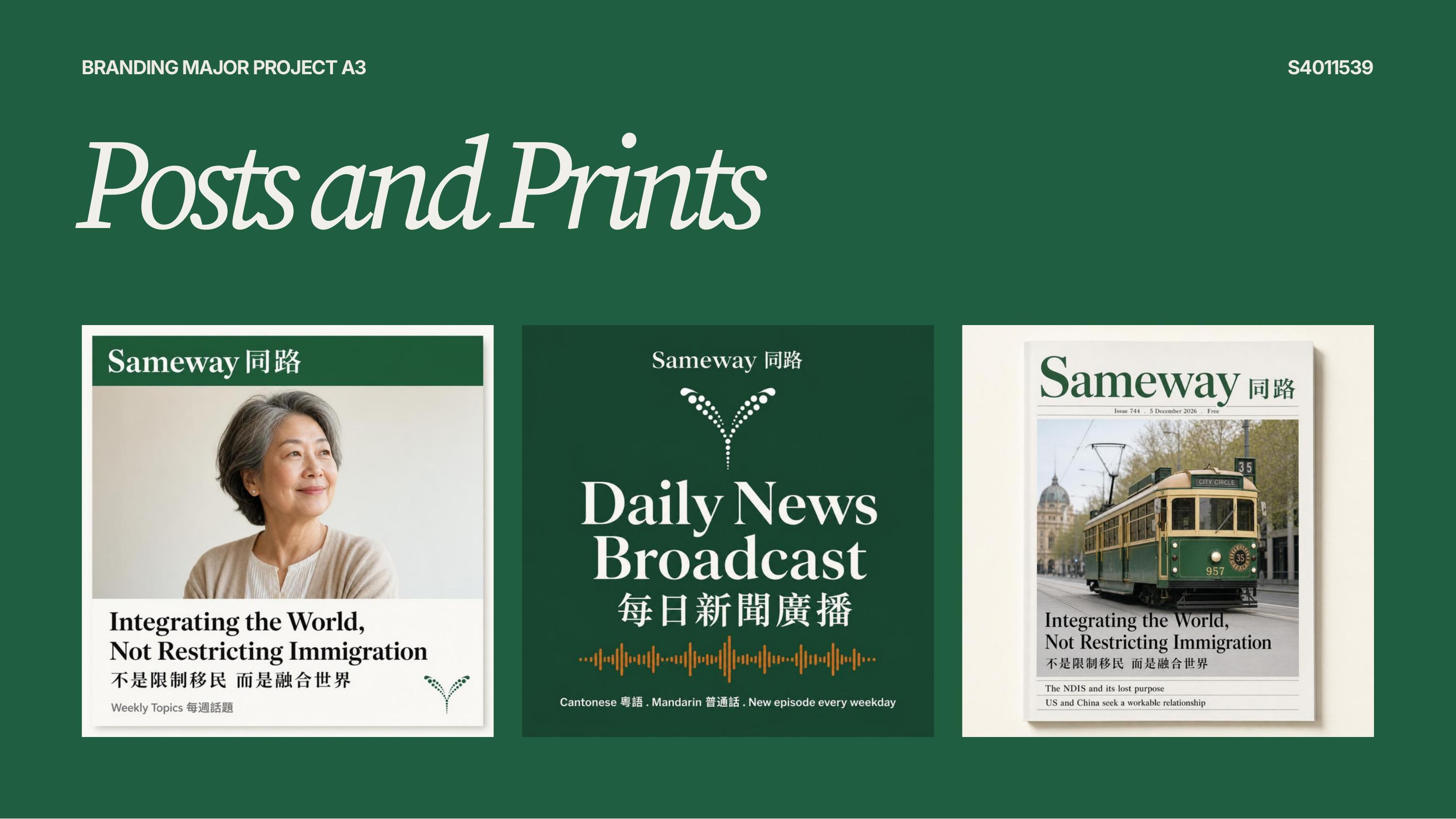
A rebrand for Sameway 同路, a multicultural Australian media outlet: a new logo mark and identity system applied across web, social, podcast, and print. The mark itself, two leaf-like forms growing from a dotted stem, represents individual community voices sharing one common root. The system was built to flex across a publication that spans written articles, a podcast, and social content in multiple languages, so the identity needed to hold up in a masthead, a podcast cover, and a phone screen equally well.
View live site

Next project